Chapter 6: Introduction to Data Analysis
The past few chapters were dedicated to finding and gathering data. But now that we have our data, what should we do with it? This chapter will help you understand how to perform simple data analyses.
In many ways, the term data analysis describes a very basic action: interviewing a data set. As with any interview, this means you ask questions of your data set. Sometimes these questions aren’t particularly complicated, and you can answer them by, say, sorting a column from its largest to smallest value. Other times they’re more complex and you need to run multiple analyses to answer them.
This chapter will introduce you to the basic concepts of data analysis through Sheets, a web-based program that Google account holders can access for free. The majority of the features we discuss are also available in Microsoft Excel.
While many of the methodologies and tools we use in this chapter can easily be replicated in Python, it’s helpful for beginners to concentrate on the conceptual steps of the analysis before getting too wrapped up in writing code. In other words, it’s useful to work out analyses in an interface like Sheets or Excel before executing them as code. To that end, in this chapter we’ll walk through the data analysis process using various methods to examine the activity of two Twitter accounts.
The Process of Data Analysis
One common assumption is that data sets are infallible collections of facts that we can just use in our research the same way we received it. Often what we think of as data sets is just summary data. But the findings in summary data come from rather messy, wildly varying replies to surveys or other databases of raw data—that is, data that has not been processed yet.
Data tables provided by organizations like the US Census Bureau often have been cleaned, processed, and aggregated from thousands—if not millions—of raw data entries, many of which may contain several inconsistencies that data scientists worked to resolve. For example, in a simple table listing people’s occupations, these organizations may have resolved different but essentially equivalent responses like “attorney” and ”lawyer.”
Likewise, the raw data we look at in this book—data from the social web—can be quite irregular and challenging to process because it’s produced by real people, each with unique quirks and posting habits. We’ll have to summarize it to find the trends and anomalies that answer the questions we’re asking. This kind of processing isn’t necessarily complicated and difficult; often it just means that we have to go through some tedious yet fairly simple tasks.
There are a few primary methods involved in the process of analyzing data. The ones we’ll see in this chapter were adapted from Amanda Cox and Kevin Quealy’s New York University data journalism class, available at http://kpq.github.io/nyu-data-journalism-2014/classes/sort-filter-aggregate-merge/.
Modifying and formatting Data is almost never organized consistently or in the format we need. By modifying and formatting it, we can more easily compare values.
Aggregating We can query our formatted data by applying simple math to it, known as aggregation. Aggregating data can take the form of finding the sum of all values within a data column, or it can mean counting the instances of a given value, like how often a name appears in a spreadsheet.
Sorting and filtering We might simply want to ask our data what the largest or smallest value in any given column or category is. We can often answer these basic questions by sorting and filtering our data. For instance, by sorting a spreadsheet in descending order, we can easily see the largest values at the top of our spreadsheet. Through filtering, we can find out which rows share a particular value.
Merging One of the most effective techniques to compare two data sets is merging them, or combining them into one set.
In the abstract, these methods may not be very intuitive, but here we’ll use them to investigate and better understand the activities of two types of Twitter users: those of an automated bot account, and those of a human.
Bot Spotting
The social web is populated both by real people like you and me, who are on social media to connect with their friends, and by bots, which are automated accounts controlled through code. Bots publish content as instructed by scripts (many of which are written in Python!). These bots are not always malicious: some automated accounts publish delightful haikus, and others send you the latest headlines from a news organization.
In this chapter, you’ll learn how to use Google Sheets to examine the social media data of a Twitter account that experts at the Digital Forensic Research Lab have identified as a bot. We’ll then compare this data to the activity of a real social media user.
Note For more details about the Digital Forensic Research Lab and their research, see https://www.digitalsherlocks.org/.
Our analysis closely resembles a BuzzFeed News analysis on spotting automated accounts by identifying various characteristics that a Twitter bot may display. Figure 6-1 shows two of the charts BuzzFeed made to illustrate the difference between bot and human activity.
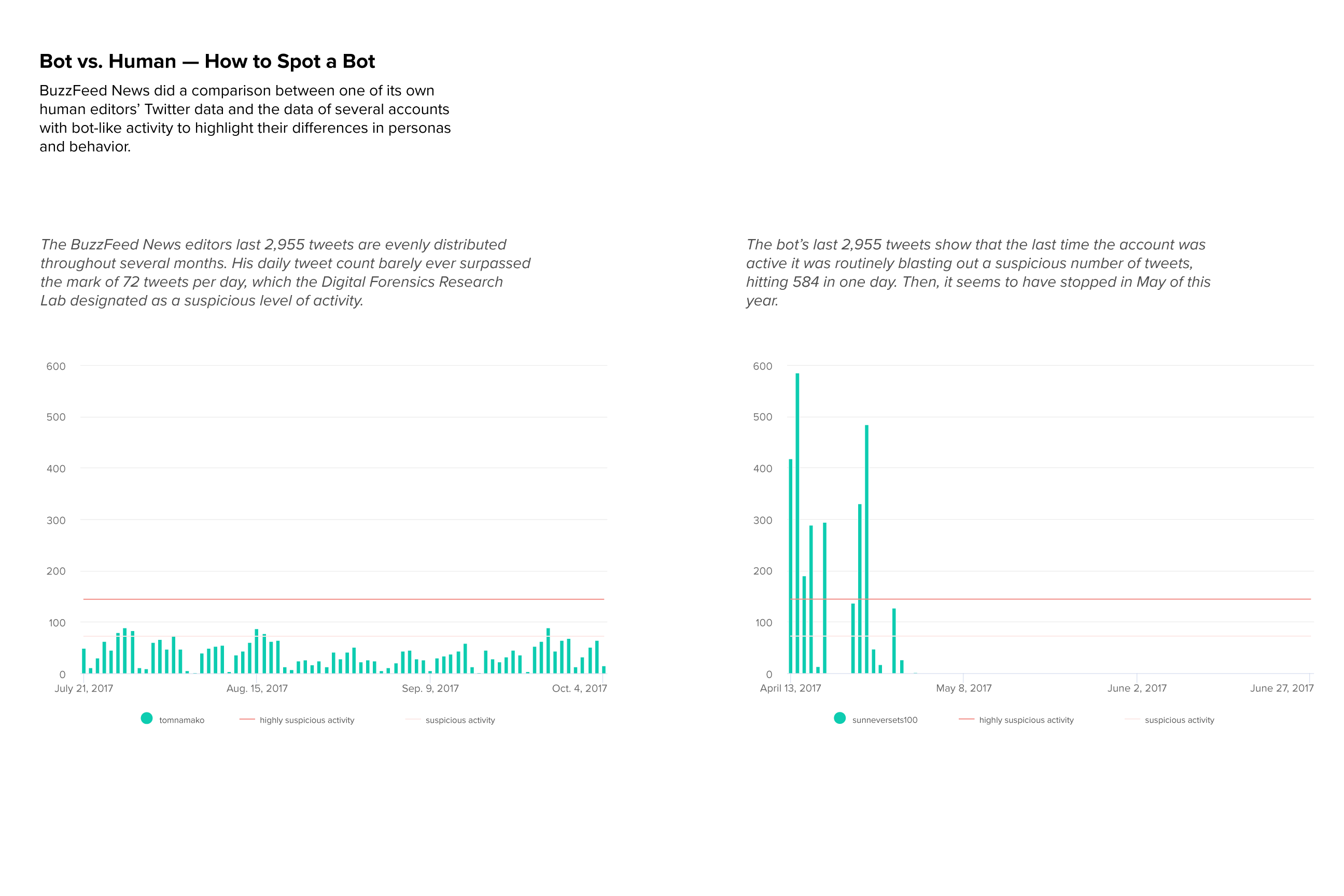
Figure 6-1: Two charts showing the activity of a human compared to the unusually high activity of a bot in 2017
Economically or politically motivated people can use bots to start online debates and steer conversations toward specific topics. In the worst-case scenario, large numbers of bots can be used to grossly exaggerate how many people hold a certain opinion.
While there’s no surefire way to nail the identity of false or deceptive online actors, one of the most telltale signs of a bot is when an account tweets more than is humanly possible. So, in this exercise, we want to look at daily activity levels for both a bot and a real human. We’ll import, clean, format, and analyze a data set of posts collected from the Twitter account @sunneversets100. In doing so, we’ll get acquainted with the helpful tools that Google Sheets offers.
Okay, ready to start bot spotting? Let’s go.
Getting Started with Google Sheets
In order to use Sheets, you need a Google account. If you don’t already have one, you can sign up for free at https://accounts.google.com/SignUp. Once you have an account, navigate to Google Drive (https://drive.google.com/), which is cloud-based storage that allows you to organize all your files.
Organizing your data is very important. Like coding, data analysis can take multiple tries to get right, and can involve several steps. Data organization, then, is not just for the sake of neatness but also for the sake of accuracy. The more organized we are, the easier it will be for us to trace our steps, modify our methodology, and reproduce our analysis in the future.
Let’s start by making a folder in our Google Drive to store any files related to our data analysis. It’s always good practice to keep each of your projects in a folder. Similar to how comments in our scripts are like notes to our future selves about our thought process at the time, the different files and folders we create are a way to help us navigate our analysis. Folders and comments allow us and others to more easily replicate our work, and can complement any other notes we may write up to document the steps of our data analyses. To create a folder, select New>Folder.
Next we need to name the folder. Having a clear naming convention for data folders and files is a great way to make sure we and observers alike can clearly understand the folder’s purpose. The naming convention you adopt for your projects is up to you, but be consistent. I usually name folders using the date and a few keywords that show what the folder contains, like this: mmddyyyy-related-keywords. For this exercise, let’s use that convention and name our new folder 04062019-social-media-exercises.
Now let’s create a new spreadsheet file. If you are not already in the new folder, double-click it through the left-hand navigation of Google Drive. When you create a file, it should automatically be stored inside that folder.
To start a new spreadsheet, select New> Google Sheets> Blank Spreadsheet. This should pop up a new tab in which the browser loads the new spreadsheet (see Figure 6-2). If you have previously used Microsoft’s Excel software, the window should look familiar.
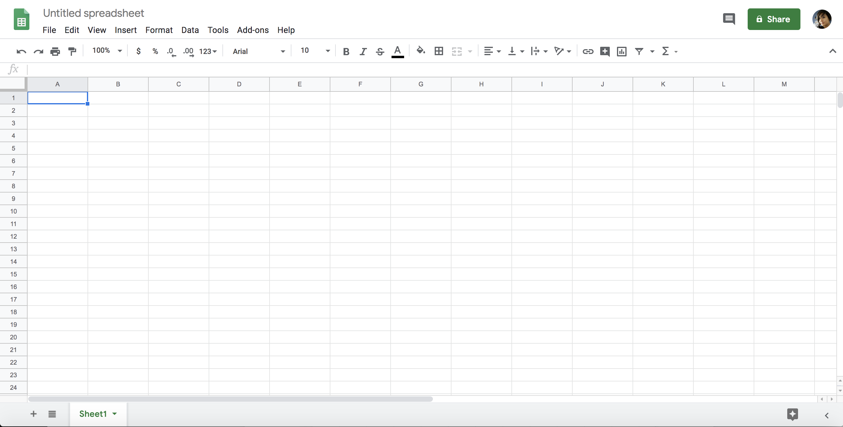
Figure 6-2: A blank spreadsheet
Let’s name our spreadsheet file using the same convention we used for the 04062019-social-media-exercises folder: 04062019-tweet-analysis-@sunneversets100.
Next, we need to populate our spreadsheet with data. For this exercise, we’ll use data from @sunneversets100, a Twitter account that tweets political news, downloaded from the Twitter API (find more information on Twitter’s API here: https://developer.twitter.com/). These tweets were collected using the social media data scripts, which you can find along with a detailed rundown on how to use them, at https://github.com/lamthuyvo/social-media-data-scripts/. The data is collected from the API as a .csv file, which is a type of file Google Sheets knows how to interact with to generate a spreadsheet. You can download the data here: https://github.com/lamthuyvo/social-media-data-book.
To start the import, go to File> Import> Upload. When prompted, choose the Upload function, navigate to the folder where you downloaded the @sunneversets100 data, and upload the .csv sheet.
Google Sheets should ask you to select import options. Select Import Location, Separator Type, and Convert to Numbers and Dates. Select Replace Current Sheet as your import location—this is how we populate our current empty sheet with the Twitter data. Because the data is formatted as a .csv file, select Comma as the separator. (You can also allow Sheets to automatically detect the separator, which will often work just as well.) Finally, when Sheets asks to convert text to numbers and dates, select No.
Understanding how text conversion works is important when it comes to data analysis, be it in Sheets, Python, or any other tool. Formatting or, as Sheets refers to it here, “converting text,” is vital for programming languages. Software like Sheets recognizes the difference between a string (in other words, text) and other types of data like integers, floats (numbers), or datetimes. While we humans can determine whether a value represents a date, number, or word based on how it’s written, most software and programming languages can’t automatically do the same, so they often need to make a sophisticated guess. If we were to select Yes under the import option Convert Text to Numbers and Dates, Google Sheets would do just that: it would try to guess which value is a number, date, or word. This is a step we shouldn’t automate. For instance, we’d want to interpret ZIP codes as text, not as numbers, since ZIP codes act like labels for an area even though they contain only numbers. If we left it up to Google Sheets, though, it would likely convert them to numbers and potentially lose information (ZIP codes starting with a zero would lose that first digit, for example). When it comes to guesswork, leave as little as possible to automation.
Once you’ve followed all the preceding steps, you should have a spreadsheet that looks like Figure 6-3.
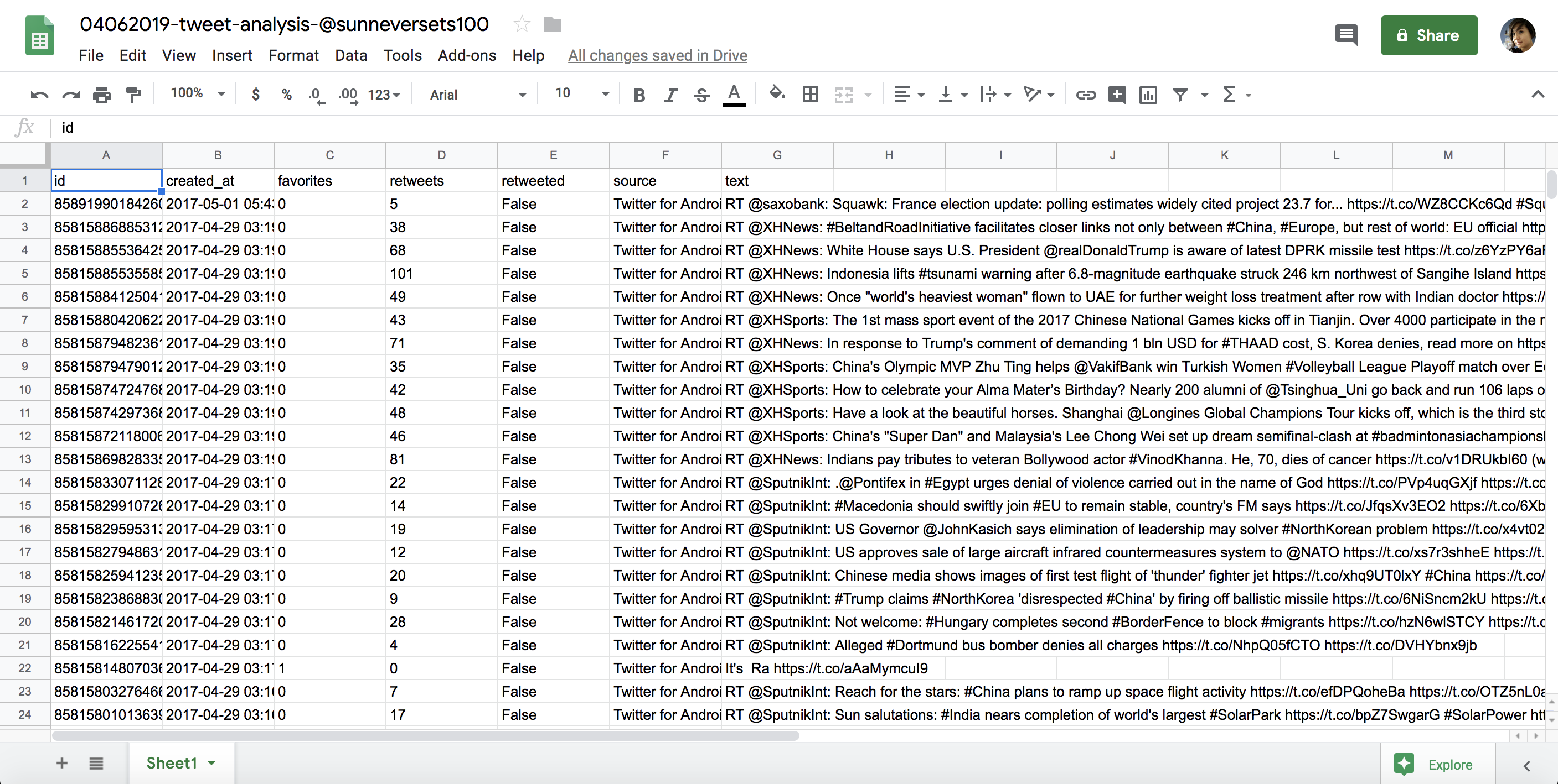
Figure 6-3: Imported and unchanged data in a spreadsheet
All right! Now we’re ready to do some data processing!
Modifying and Formatting the Data
To effectively use the Sheets functions, we need to make sure that Sheets is interpreting each data column properly. This is where formatting comes in handy. However, before you start changing your spreadsheet, we need to do one of the most important steps in data analysis: make a copy of the original, unchanged data set.
Humans are fallible. We should always triple-check our data manipulations and calculations, but we should also make sure we can go back to the original data set in case we make a mistake along the way. While Google Sheets, like other Google products, automatically tracks your changes as you work (see File>Version History), you should always keep a copy of the data in a format that is easily accessible and allows you to reference it as you do your analyses. That way, you won’t need to pull up older versions of your spreadsheet when you want to see how the data originally looked.
The easiest way to do this is to create a copy of the sheet for each step of the data analysis and rename it accordingly. This can be particularly helpful when we create, change, or remove values or entire columns from our data set. Destructive modifications of our data may be hard to undo later, so tracking our steps through multiple sheets can make things easier in the long run.
First, go to the bottom of the sheet, double-click the Sheet 1 sheet tab, and give it a name describing the content. In this case, we rename the first sheet raw data. Then, to duplicate the sheet, click the arrow by the sheet name and select Duplicate from the menu that pops up, as shown in Figure 6-4.
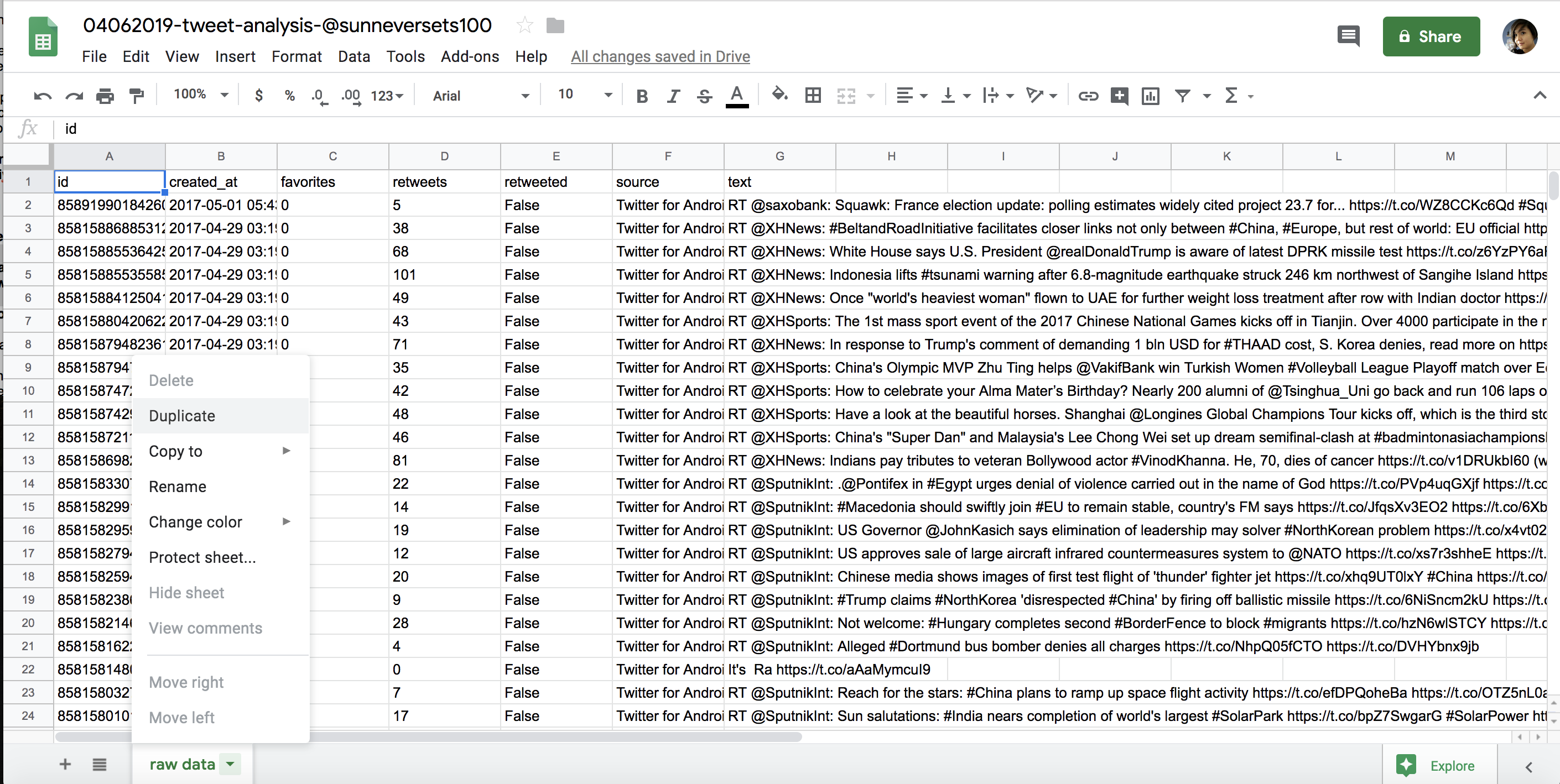
Figure 6-4: Duplicating sheets
This should open a second sheet, which we can also rename. For this exercise, call it step 1: modify and format. This is the spreadsheet we’ll use to apply our formatting. In the step 1 spreadsheet, select the column that contains the counts of favorites for each tweet by clicking the letter above the column header (in this case, the values we’re interested in are the timestamps in column B). The entire column should be highlighted blue. Then, select Format> Number> Number, as shown in Figure 6-5.
This transforms every value in that column from a string to a number. You’ll need to repeat these steps for the retweets column, which also contains numbers.
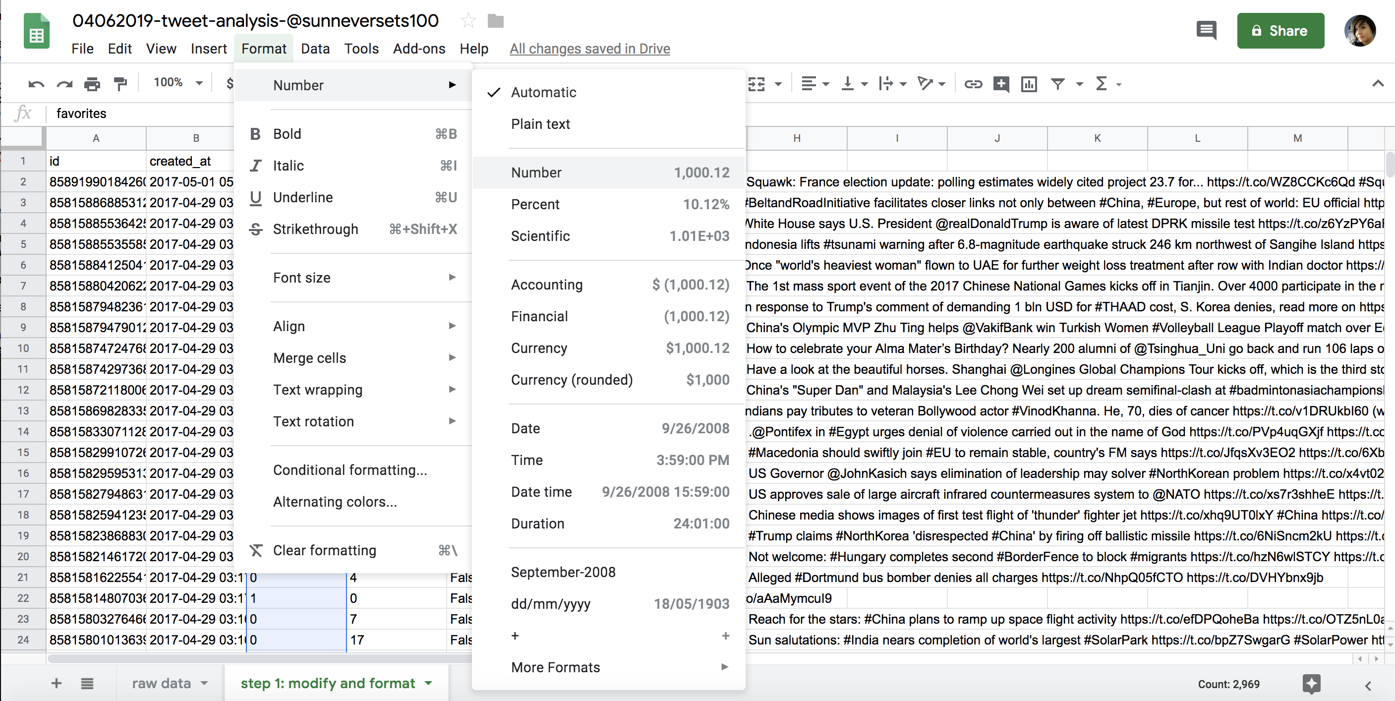
Figure 6-5: Spreadsheet formatting options
Note that the timestamp that we get from the API is very granular and representative of how Twitter structures and stores it in databases. Granularity in data is great. It allows us to aggregate our data in various ways: we can see the exact time when the tweet was sent, down to the second, or look at the date when the tweet was published. To access these different kinds of data summaries, though, first we’ll need to modify our data.
As I’ve mentioned, data analysis often consists of the tedious and sometimes groan-inducing process of getting the data into the right format. Particularly for data created by humans, this means that we need to clean data before we can compare values. For example, if we were collecting tweet text data, we may need to resolve various spellings of the same word (for example, “gray” versus “grey”) or remove misspellings and typos. For data that is collected through code or by robots, we may need to modify the data by separating it into various parts or finding different ways to combine it. In the case of the timestamp data, for example, we may want to separate the date of a tweet’s publication from the time of day when it was sent.
Let’s quickly recall what our task is: we are analyzing a suspected bot’s Twitter activity to distinguish it from human activity. We can do this by looking at the average number of times per day the suspected account @sunneversets100 tweets. Experts say that bot activity is unusually high compared to human tweeting. According to the Digital Forensic Research Lab, tweeting 72 or more times per day is suspicious, and tweeting 144 or more times per day is highly suspicious. Now we can use Sheets to determine whether @sunneversets100’s activity levels are suspiciously high.
Currently, our timestamp data displays both the date and the time to the second that a tweet was posted, like this: 2017-05-01 05:43:57. We can get a daily tally of tweets @sunneversets100 published by counting how many times any given date shows up in our raw data. To accomplish this task, we’ll use a Sheets feature called pivot tables. But to use pivot tables, first we have to create a new column that contains only the date that each tweet was posted. We need to modify the column containing the entire timestamp by removing the hours, minutes, and seconds so we’re left with only the dates.
One simple way to separate the data is to use the Split Text to Columns tool under the Data menu. This built-in tool looks for repeating characteristics within column values. Once it detects a pattern, it will try to split the value into two columns. Patterns could include things like a first and a last name separated by a comma (like “Smith, Paul”) or, in this case, a date and a time separated by a space.
To use the tool, first we’ll create an empty column to the right of our created_at column. Right-click the letter above the created_at column and select Insert 1 right from the menu. Now we can use the Split Text to Columns tool without overwriting any other data. Click the letter of the column containing the timestamp data, and then select Data> Split Text to Columns.
You’ll be prompted to choose a separator through a small pop-up menu. The separator defaults to Detect Automatically, but since we’ve determined that the part separating our date and time is a space, we can choose Space. The tool should leave the values to the left of the separator in the current column and move the content to the right of the separator in the new column we just created.
This tool works best with data that has been formatted as plaintext, which Sheets interprets as a string. Remember when we first we imported our data and Sheets asked to convert the text to numbers and dates, we selected No. That ensured that each data cell would be interpreted as a string of characters rather than as numbers or dates. For this exercise, it is best to manipulate our values as strings before we format them as any other data types.
We’ll often need to reformat entire columns to tell Sheets how to interpret each data type. We can only take advantage of date-based functions if a string is formatted as a date like those in the created_at column. Likewise, mathematical operations can be done only on values that have been formatted as numbers.
We don’t need to change the format for the data values in our spreadsheet just yet. For housekeeping’s sake, however, we should rename our new columns. Name the column with the newly isolated dates date and the column with the newly isolated times time.
Et voilà! We have split the values of one column into two and can now proceed to count how often a date occurs.
Aggregating the Data
We’ve now completed the basic steps to set up data for analysis. First, we imported the data into Sheets, and then we modified it so it’s formatted in a way that allows us to analyze it. Now that the data is prepared, we can move on to the next step of the data analysis process: aggregating the data. We’ll use two Sheets features to do so: pivot tables and formulas.
Using Pivot Tables to Summarize Data
Pivot tables are one of the most powerful features of Sheets. They allow us to summarize large amounts of detailed data and analyze it in various ways—for example, we can count the number of times a term occurs in a column or calculate the sum of numerical values based on a date or category. In other words, pivot tables give us a bird’s-eye view of a large amount of data in an easy-to-navigate interface. They do so by creating a summary table, which includes statistical information about our raw data, like the total number of times a value occurs inside a column.
We can use pivot tables to find the frequency of each date in our Twitter data set. Since we know that each row in our data set represents information about an individual tweet, we can safely say that the number of times a specific date appears also represents the number of tweets the @sunneversets100 account published on any given day.
To do this analysis, first we need to select the data we want included in our pivot table. To select all the data in the step 2: modify and format sheet, click the rectangle above the first row and to the left of the first column. Then select Data> Pivot Table… (see Figure 6-6) and select the option New Sheet when Sheets asks where to insert the Pivot table. This should open up a new sheet called Pivot Table 1.
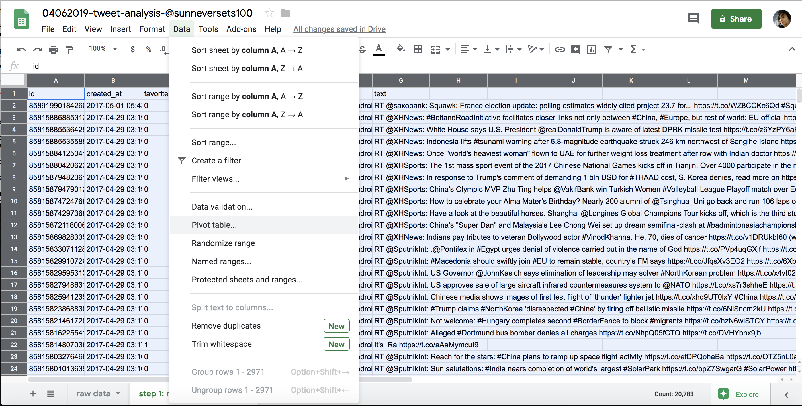
Figure 6-6: Accessing pivot tables in the Data menu
On the right-hand side of the newly created sheet, Sheets offers a number of options to populate our pivot table. We want to populate our rows with the dates we isolated in our column.
Select Rows> Add, and then select the date column from the drop-down menu. Once you’ve selected the date column, Sheets creates a row for every date that occurs in the data set. Then we need to tell the pivot table what kind of values to display for the summarized dates. These values will appear in a column next to the dates.
We want to count how many times each unique date occurs. Click Values> Add, choose the date column again, and select the kind of math you want Sheets to perform on the data. In this case, there are two options that sound like they might work for our analysis: COUNT and COUNTA. We’ll choose COUNTA since COUNT works only with data formatted as a number. You can think of COUNTA as a tool that can count anything.
This creates a pivot table that summarizes the number of times a date occurs in the detailed data set (Figure 6-7). This pivot table allows us to make an initial assessment of the @sunneversets100 account. We know that an account tweeting 72 or more times a day is suspicious, and that an account tweeting 144 or more times is highly suspicious. Are there days when this account tweets 72 or more times a day? Certainly! Are there days when it tweets more than 144 times? Indeed! On the busiest day, the account tweeted 586 times. That means @sunneversets100 tweeted roughly every 2.5 minutes over a 24-hour period, which doesn’t sound like something a normal person would do if they just wanted to share their thoughts with the world.
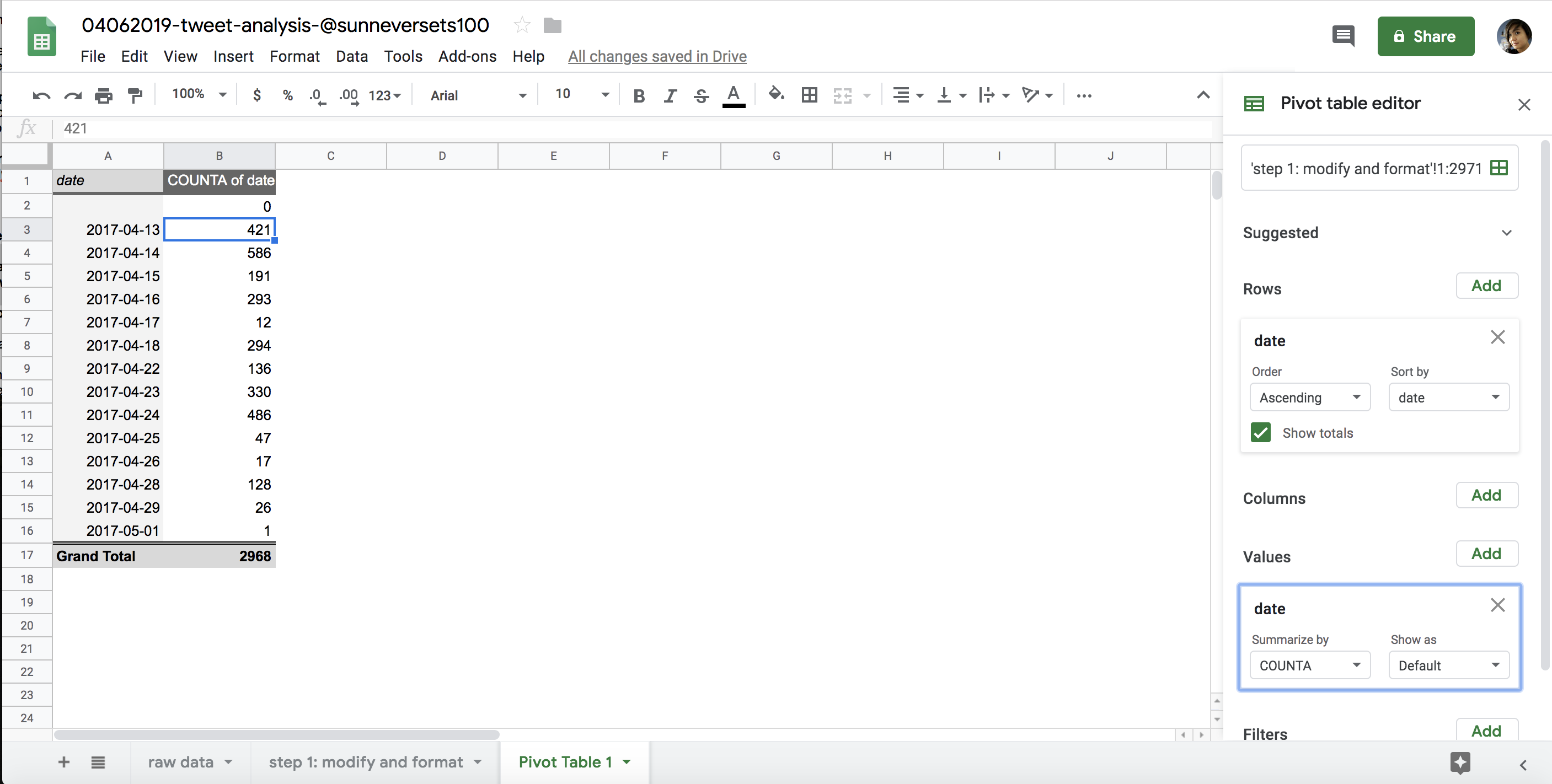
Figure 6-7: The pivot table we generated by using COUNTA to find the occurrences of each date
Using Formulas to Do Math
We just used a pivot table to answer an important question about our data: how often does a particular Twitter account tweet per day? Using this tool allowed us to look at the days when the bot tweeted a number of times that’s considered suspiciously high for a human user. Tweeting behavior, however, can vary from day to day. Even if an account tweeted 72 or more times one day, that doesn’t necessarily mean the account is consistently tweeting a suspicious number of times.
Let’s say we need to also find the average number of tweets that the account published. We’ll use a new feature to answer our question—welcome to the joy of formulas!
You can think of formulas as functions that are built into Sheets. Sheets distinguishes between ordinary data and formulas through an equal sign (=). All formulas consist of an equal sign followed by a function name and an open and closing parenthesis—for example, =lower(A2).
I often tell my students that if they are using formulas in Excel or Sheets, they are already doing rudimentary coding. Like Python functions, formulas have strict rules (that is, syntax), take arguments, and allow us to create new values based on the interaction between those rules and arguments.
For example, we used the Python len() function and passed it the string “apple pie” to find the length of that string in Chapter 1:
>>> len("apple pie")

9
Sheets has a formula called len that accomplishes exactly the same thing. To use it, open a new spreadsheet and enter the following into the top-left cell:
=len("apple pie")
The cell that you used to write your formula should display the number 9.
What’s even more exciting is that we can pass spreadsheet cells to the formulas as arguments. We specify a cell as an argument by finding its coordinates on the spreadsheet using its column letter and its row number, which can be found at the top and the left-hand side of the spreadsheet, respectively.
Next, enter apple pie into the second cell in the first column. This means the cell is in column A and row 2. We can find the length of this string by replacing “apple pie” with the cell coordinates A2 in the formula stored in the first cell, like so (note that we do not use quotation marks when we use cell coordinates):
=len(A2)
We can also pass multiple cells to some formulas. The syntax to select multiple cells changes depending on which cells we’re trying to select.
To return to our data analysis, we want to find the average number of posts tweeted by the @sunneversets100 account. We can use the aptly named =average() formula to do so.
The =average() formula takes a group of cells and finds the average of their values. The formula allows you to select individual cells or cells in ranges. For example, we can get the average of all the cells in our pivot table by passing the =average() formula a list of cells, each separated by a comma:
=average(B2,B3,B4,B5,B6,B7,B8,B9,B10,B11,B12,B13,B14,B15)
A clearer and more convenient way to use the =average() formula, though, is to use a colon to select a range of consecutive cells. The range starts in the cell specified before the colon and includes all cells through the cell specified after the colon.
To get the average of cells B2 through B15, for instance, we use this formula:
=sum(B2:B15)
To select an entire column, we can use the colon without any row specifications like this: =average(A:A). The same goes for rows: =average(2:2). Sheets also allows us to select cells from a different sheet of the same file by specifying the sheet name in quotation marks followed by an exclamation mark, like this: =average(‘Sheet 1’!A:A).
One last way to select cells is by using your cursor. Select an empty cell and start by writing the formula up until the opening parenthesis. For this exercise, we’ll reuse the =len() formula, so enter =len(. Then use your cursor to select a cell that you want to pass to the formula. In this case, select the cell A2. This should autopopulate the formula with the cell coordinates. Add a closing parenthesis. The completed formula =len(A2) should display 9 so long as cell A2 contains the words “apple pie.”
Now that you’ve seen how formulas work, you can go back to the Twitter analysis and apply what you have learned. Go back to your pivot table and enter the formula =average(B2:B15) into an empty cell. Once you hit return, you should see that the average number of tweets per day from the @sunneversets100 account is 212. Still suspiciously high!
Google Sheets comes with countless formulas like these. For instance, if we enter the formula =sum() into a cell and select a column of numbers, we can find the sum for those values.
One great thing about formulas is that we can copy and paste them into multiple cells to perform the same actions on several columns or rows of data. Even better, Sheets allows for smart copying and pasting. To see how that works, return to the step 1: modify and format sheet.
Say we wanted to measure the length of each tweet in our spreadsheet. We could create a new column to the right of column H, which contains each tweet’s text. If we enter the formula =len(H2) into cell I2, copy the formula, and then paste it in all the rows following I2, Sheets is smart enough to figure out the length of each tweet, not just the tweet at H2 that the original formula refers to.
This is because Sheets doesn’t copy just the actual letters of the formula; it has built-in logic that alters the formula’s arguments in relation to the cell in which it is applied. In other words, Sheets remembers that we’re trying to measure the length of the tweet right next to the cell that contains the formula, not the cell in position I2.
We cannot possibly cover every formula available through Sheets, but one handy tool to keep in mind for the future is the small helper window Sheets shows when it detects that you’re using formulas. The window pops up when you begin entering a formula and usually displays information about what type of arguments the formula takes, shows you an example of how the formula may be used, and spells out what data the formula outputs, as shown in Figure 6-8. It’s not a complete glossary of formulas, but it’s a good place to start experimenting.
With pivot tables and formulas, you now have the tools to execute simple operations to answer questions about a data set in just a few clicks. More importantly, hopefully you’ve also seen that you can answer data queries in more than one way.
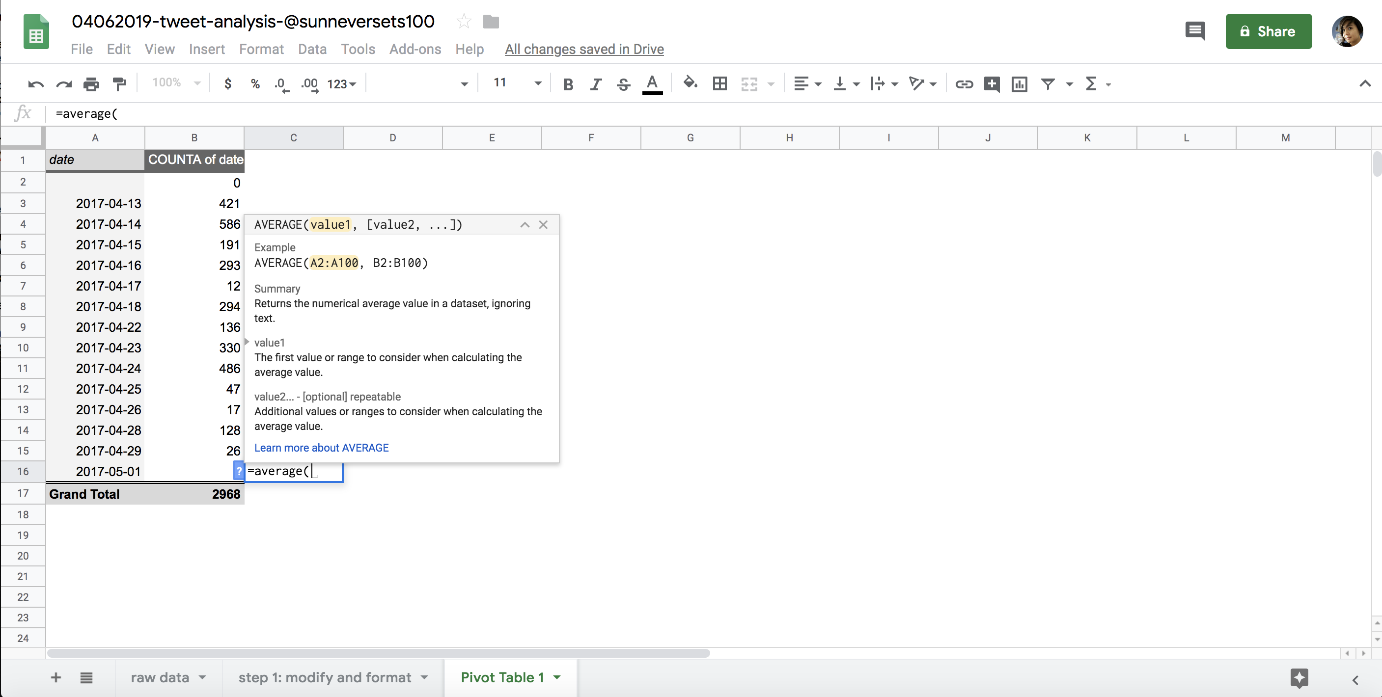
Figure 6-8: The pop-up formula helper window in Sheets
Sorting and Filtering the Data
Now that you know how to import, modify, and aggregate data, the next step is sorting and filtering the results in order to rank or isolate the data we’re looking for.
Ranking data findings from largest to smallest or vice versa is a good way to assign a hierarchy to results and makes it much easier to communicate them. Within the context of our analysis, we can sort the data in our pivot table to get an idea of how often the suspected bot account tweeted on its busiest day. One way to do so is by creating a new sheet with our aggregate results and changing the entire sheet to a filter view.
First, select the findings of the pivot table by clicking and dragging your cursor across all the cells you want to include in the sorted table. Once you have the cells highlighted, copy the selection by right-clicking inside one of the highlighted cells and selecting Copy (or use the shortcut cmd-C for Mac, or ctrl-C for PC).
Then, as with the other steps, follow best practices by creating a new sheet to use for sorting the pivot table data. To populate this sheet with the pivot table results, we’ll use a method called paste special.
Because copying in Sheets copies formulas and pivot table functionalities to the new spreadsheet, we won’t be able to modify the actual values that are represented in our pivot table. Luckily for us, though, Sheets allows us to paste values based on the results of formulas and pivot tables. Right-click in the cell in the first row and first column of your new sheet and select Paste Special> Paste Values Only. That should paste the values, rather than the formulas, into the cells. When you paste these values, they’ll be stripped of any formatting. This means that the dates we copied and pasted into the new cells may be formatted as strings of integers. To format them into dates again, use your cursor to highlight the cells containing the dates, right-click inside one of the highlighted cells, and select Format> Number> Date.
Now we need to select the data we want to turn into a filter view. The easiest way to select all the data in the current sheet is to click the blank rectangle next to the first column and above the first row. Next, click the little arrow next to the filter icon (which looks like a funnel) and, with the cells selected, select Create New Filter View (Figure 6-9).
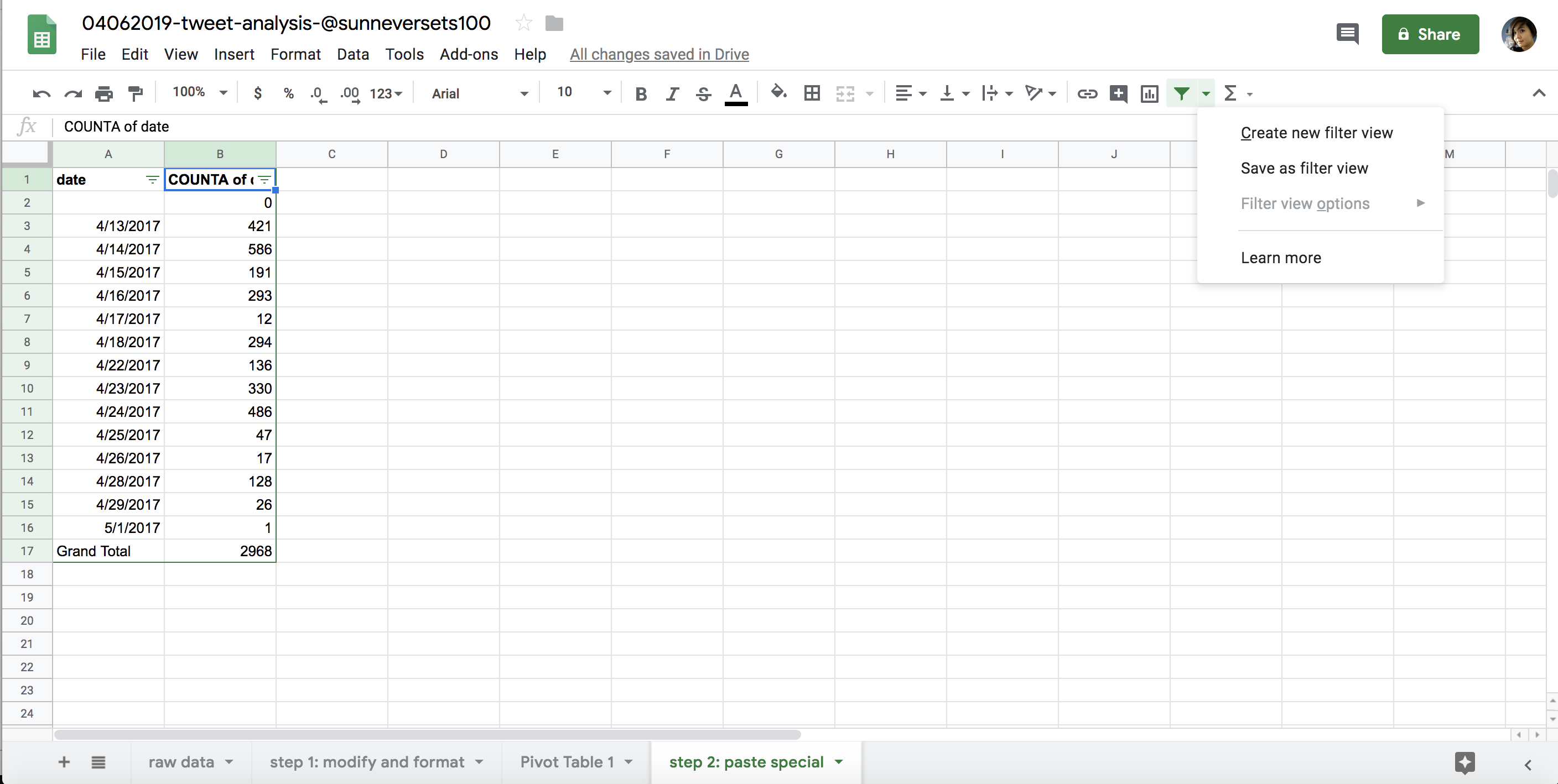 Figure 6-9: Filter view options in Google Drive
The Filter View tool allows us to access various functionalities for each column, such as filtering our data by values or conditions (for instance, we can filter our tables to display only values greater than 100). We can also sort the data. This tool doesn’t modify our data set—it merely changes the order in which we see our data or which parts of it are visible (when we filter out values, we’re not deleting them; they’re just hidden while the filter is applied).
Let’s look at our filter options. By clicking the triangle next to each column header, we can filter our spreadsheet to show only subsections of our overall data set. We can select and deselect values within each column and hide or show rows based on whether they contain each value.
Filtering can be helpful when we’re interested in analyzing only a subset of our data. It’s commonly used to isolate raw data based on a minimum or maximum threshold or on a certain time frame. The filter options can also help us ask more specific questions of our data set. In our tweet analysis, for instance, we may be interested only in tweets that have at least 100 retweets. Alternatively, we may want to look at tweets that were published within a specific month.
We can also filter values based on a condition, or conditional—a concept we explored earlier while discussing Python. Google Sheets has a number of handy conditionals built into its filter tool that allow us to filter our data based on fairly simple conditions. If we select the Filter by Condition>Cell Is Not Empty option, for instance, our sheet will show only cells that have data (see Figure 6-10).
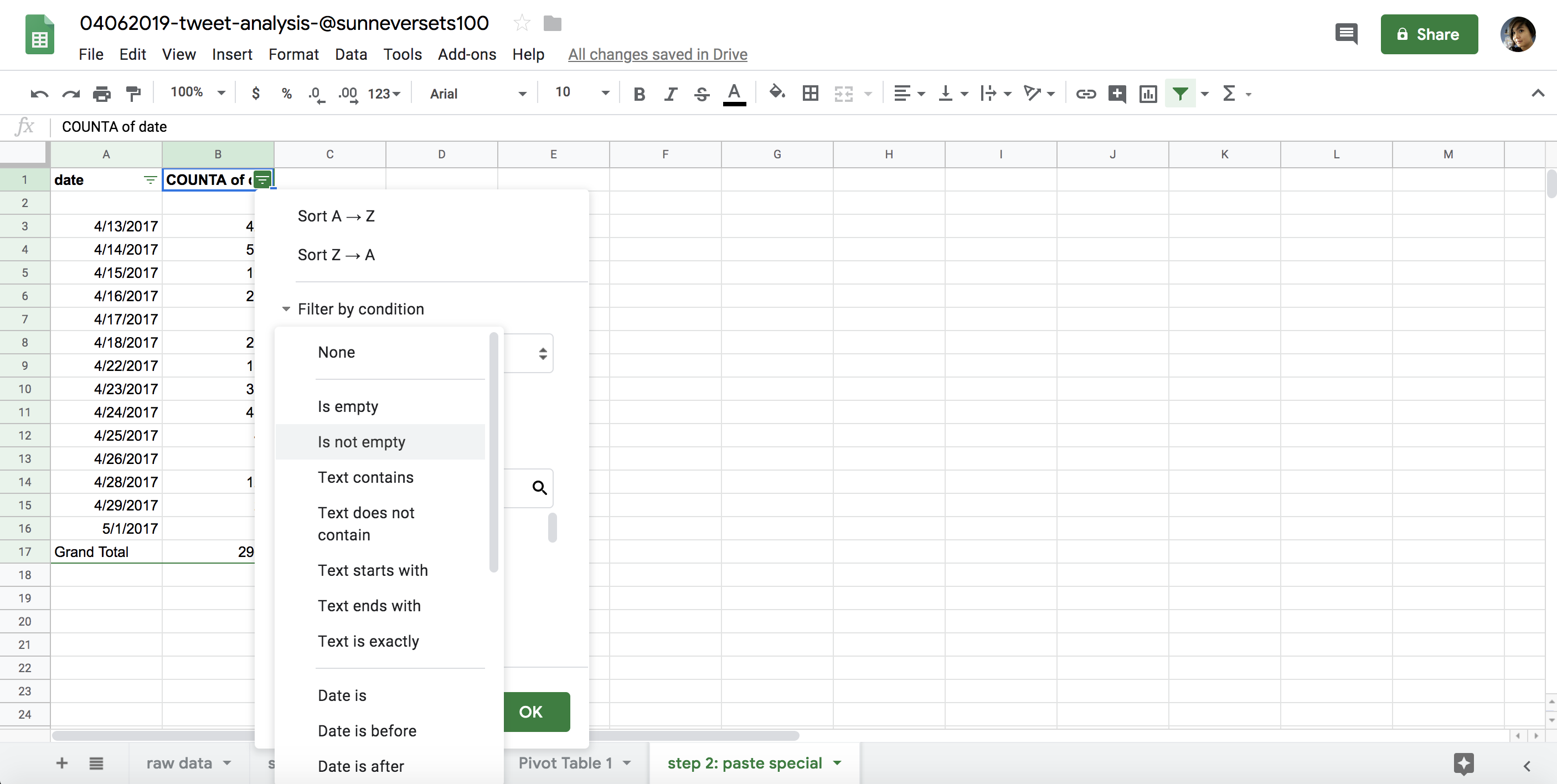
Figure 6-10: Filter options in Google Drive
Finally, we can sort our data using the Sort AZ and Sort ZA options. Sort AZ allows us to sort our rows in ascending order: from smallest numerical value to largest, from earliest to latest date, or from A to Z in alphabetical order. Sort ZA sorts our data in descending order, which is the reverse of ascending order.
Sorting a data set may help you answer one of many research questions you have. For our Twitter analysis, this might include questions like these: What was the earliest tweet sent by this account? What was the latest? Which tweet garnered the most favorites? Which one got the most retweets? Try filtering the data to answer these questions.
Merging Data Sets
The last method we’ll consider for our data analysis is merging, or joining, data sets. Comparing one data set to another is one of the most powerful ways of using tools like Sheets. By merging two sheets, we can easily compare values based on a common category.
We should be cautious about drawing major conclusions about the relationship between data sets, however. Correlation is not the same as causation. This means even though two data sets may seem like they have a relationship—that is, the data sets seem correlated—that doesn’t mean that one data set caused the results in the other. Correlational and causational connections between data sets should be backed by other research from reports, experts, or field studies. But even the simplest comparisons between two or more data sets can be very illustrative.
So how do we join two tables in Sheets? We can use a handy formula called =vlookup() to help us cross-reference two spreadsheets and merge them based on a common value. We use this formula by referencing one value and looking it up in a table that serves as a dictionary.
For instance, to compare the tweet activity of @sunneversets100 to that of a Twitter account operated by an actual human—you—during the first two weeks of 2017, you can walk through the same steps you did for @sunneversets100 with your own account. If you don’t have a Twitter account, you can make a copy of a spreadsheet (https://github.com/lamthuyvo/social-media-data-book), which has the information for the human-managed @nostarch account (https://twitter.com/nostarch/).
To merge the two spreadsheets, first create another tab within your spreadsheet. You’ll soon populate the left column with the dates you’re interested in—in this case, the data from the first half of 2017 since that’s the time period when @sunneversets100 was tweeting. We can call this column merged_counts_sunneversets100_<account> where <account> is the name of the human-controlled Twitter account.
For a time series, we could enter a column header at the top called date and then fill in a date for each row. We’ll start in cell A2 with the earliest date, 4/13/2017. Enter this date into the spreadsheet. Then in A3 enter 4/14/2017. We want the rest of the rows in the columns to contain dates until we reach the last date that @sunneversets100 tweeted, 5/01/2017. Instead of entering each date individually, you can use some convenient Sheets functionality to fill in the rest of the column. Enter two dates, select them, and then mouse over the bottom-right corner of the second cell until your cursor turns into a little cross. Then either double-click or click and drag the cross down to row 20. Sheets will autopopulate the rows based on the pattern it detects in the first two cells.
Next we need to merge the pivot table of @sunneversets100’s tweets with the sheet that contains our dates using the =vlookup() formula, which looks at a value in one table, looks up the value in another table, and then retrieves data based on this common value. Before we do that, though, set up a new column for @sunneversets100’s daily tweet counts right next to the date column.
There are four arguments that the =vlookup() formula uses within its parentheses. First, it wants to know which value you want to look up:
=vlookup(A2, ...)
This is the value =vlookup() will look up in another table. In this case, the A2 cell should contain the first date in our series of dates, 4/13/2017.
For the second argument, the formula wants to know which range represents the reference table or dictionary where we’ll look up our value.
=vlookup(A2, 'Pivot Table 1'!A:B, ...)
In our case, this is the range of values that represents the table where we’ll look up the value in cell A2 (4/13/2017). We first specify as a string the name of the sheet containing our lookup table and the daily counts of tweets for @sunneversets100 (in this case, ‘Pivot Table 1’), followed by an exclamation mark (!), indicating that ‘Pivot Table 1’ is the name of a different sheet. After that, just as we did when selecting cells earlier, we need to specify the columns where the values of our lookup table live, which in this case are columns A and B, represented in Sheets as A:B.
The range we selected should include the column we’ll use to join our data sets (the dates in column A) as well as the values we want to use to populate our new and merged table (the counts in column B). In this case, we need to ensure that the column A contains the dates because we’re trying to find the date represented in cell A2 (4/13/2017) within that column. With pivot tables, we always need to make sure that the first column in our range contains the values we’re looking up.
Once Sheets finds the date represented in cell A2 (4/13/2017) in column A of our ‘Pivot Table 1’, it will inspect the row that contains the date 4/13/2017 and then look for a value in that row that it’s supposed to transfer over to our merged data set. This is where the third argument of the vlookup() formula comes into play: vlookup() requires us to tell it which column contains the values we want to splice into our new merged table. And, to complicate things, it wants to know the column position relative to the first column of our range. In our case, this data lives in the column next to the date column and hence represents column number 2 within our range.
=vlookup(A2, 'Pivot Table 1'!A:B , 2, ...)
It may help to imagine Sheets going through these two tables like a directionless robot that wants really foolproof instructions on what to do. So far, with this formula, we’ve told Sheets to remember the date contained in cell A2 (4/13/2017). Then we told Sheets to wander over to Pivot Table 1 and sift through columns A and B to find the date 4/13/2017. Once it finds the row in column A that contains the date, we want it to go to the second column (or column 2) of the range that we selected via ‘Pivot Table 1’!A:B.
Almost there! Last we need to explain to =vlookup() whether the range we’re looking at has been sorted in the same order as the table we created for our data merge. In this case we choose FALSE (for safety’s sake, it’s good to default to FALSE, since selecting this option will return the correct results even if the lookup table has been sorted in the same order as the current table).
=vlookup(A2, 'Pivot Table 1'!A:B, 2, FALSE)
To run this formula across an entire column for the time frame we designated—April 13 to May 1, 2017—we can copy and paste it into the entire column. As mentioned before, Sheets allows for smart copying and pasting and will run each formula for each date, instead of just pasting the same formula verbatim into each cell, which would apply our formula only to cell A2.
Once you do this, the cells in the @sunneversets100 column should now contain a series of formulas.
If we replicate the process we followed for @sunneversets100 with the human Twitter account, we get a new merged table that allows us to see the data side by side, as shown in Figure 6-11.
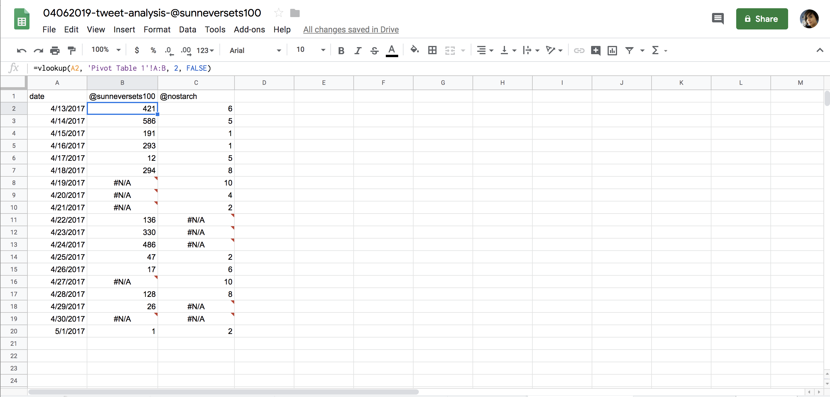
Figure 6-11: Our analysis, with errors rendered in cells where the vlookup() formula was unable to retrieve data from a lookup table
You can see that some of our results are #N/A, which means not available and indicates that our formula returned an error. This is because there’s no data for some of the dates that we generated for our pivot tables. These are dates when the account @sunneversets100 or the human account didn’t tweet.
To avoid these errors, we should fill the cells that currently contain #N/A with the numerical value 0. One way to do this is to modify our current formula so it can handle an error when one occurs. This is an important concept to keep in mind during your analyses, since this issue often recurs throughout a programmer’s workflow.
Sheets provides a helpful formula called =iferror() that we can use here. The =iferror() formula takes two arguments. The first is the formula we want to run on the cell—in this case, vlookup(). Since we’ve already written that formula, we just have to nest it and its arguments inside our iferror() formula.
Here’s how the iferror() formula should look with its first argument:
=iferror(vlookup(A2, 'Pivot Table 1'!A:B, 2, FALSE), ...)
Note We don’t need the equal sign for the vlookup() formula here; we only need one at the beginning of a cell to indicate to Sheets that we’re going to use a formula.
The second argument iferror() takes is the value that Sheets should fall back to in case the first argument—in this case, our vlookup() formula—returns an error. For our purposes, we want that fallback value to be 0. That’s because our pivot table aggregated the number of tweets only for dates in our data set on which tweets were published, and we want to include the other dates as well to eliminate the #N/A results.
The finished iferror() formula should look like this:
=iferror(vlookup(A2, 'Pivot Table 1'!A:B, 2, FALSE), 0)
Once we’ve replicated the formula across both columns, the merged table should show two columns side by side (see Figure 6-12).
As you can see, a bot tweets a lot more than the human account we analyzed. While this is not the most statistically representative analysis, this anecdotal data can still help us understand how automated accounts may compare to the accounts of real human beings.
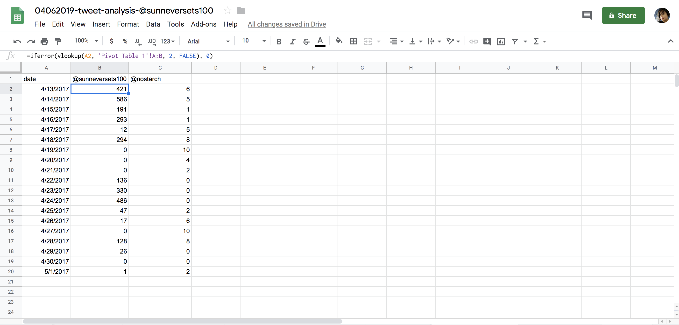
Figure 6-12: What our finished spreadsheet should look like
Furthermore, we’ve learned some very important principles. You now know you need to modify and format your data for a computer to truly understand it. You’ve learned how to aggregate raw data into larger summaries based on categories. You’ve learned that sorting and filtering your data can bring clarity to your analysis by showing hierarchy. And you’ve learned about the power of merging data sets. These concepts will play into a lot of the work you do both in Sheets and in Python. They should help guide your thought processes as you continue to develop your skills as a data analyst.
Other Ways to Use Google Sheets
This chapter introduced a number of different functionalities within Google Sheets, but the program has numerous other capabilities that we didn’t have the space to discuss here. Google has a handy manual that walks through some of them here: https://support.google.com/docs/answer/6000292?hl=en&ref_topic=2811806/.
It may be worth digging further into other formulas available in Sheets. Some of the most popular formulas are often used to manipulate strings or to do math (you can find a long list of them here: https://support.google.com/docs/table/25273/).
Eventually, you may even want to write your own custom functions if you find yourself performing the same tasks over and over again. Here’s a handy walk-through of how you can do that: https://developers.google.com/apps-script/guides/sheets/functions/.
Sheets is capable of dealing with a large number of simple analyses and has a wealth of resources available online, which may cover your needs. But it does have its limitations, especially when it comes to the amount of data it can handle before it freezes or slows. We’ll look at the Python library pandas in a later chapter for analyses that resemble some of those we covered here, but on a much larger scale.
Summary
In this chapter, you saw how to conduct simple data analysis with Google Sheets: you learned how to import and organize data in Sheets, how to ask specific questions of a data set, and how to answer those questions by modifying, sorting, filtering, and aggregating the data.
In the next chapter, we’ll build on the analysis we started in this chapter and learn how to better understand our findings with visuals. We’ll use tools like conditional formatting and charts to interpret and communicate our results more efficiently.