Chapter 7: Visualizing Your Data
So far you’ve learned how to collect, process, and crunch data from social media. The next step of data analysis is to harness the power of visualizations to make better sense of your findings.
Visualizations are effective ways to understand data almost instantly. A chart, for instance, can help us grasp how our data behaves over time. A color-coded spreadsheet can deliver a clear picture of the range of values in a data set.
In this chapter, we’ll discuss how to use visualizations with the Twitter bot data we analyzed in the previous chapter. We’ll use charting tools and visual formatting in Google Sheets to gain a deeper understanding of this data.
Understanding Our Bot Through Charts
In Chapter 6, we used a standard developed by the Digital Forensic Research Lab to determine whether the Twitter user @sunneversets100 was an automated “bot” account rather than an actual person. As a reminder, tweeting 72 or more times per day is suspicious activity that indicates an account might be a bot, and tweeting 144 or more times a day is considered highly suspicious behavior. We found that there were many days when @sunneversets100 tweeted quite a bit more than either threshold.
At the end of that chapter, we also looked at how the bot’s behavior compares to that of a normal person. Figure 7-1 shows the results.
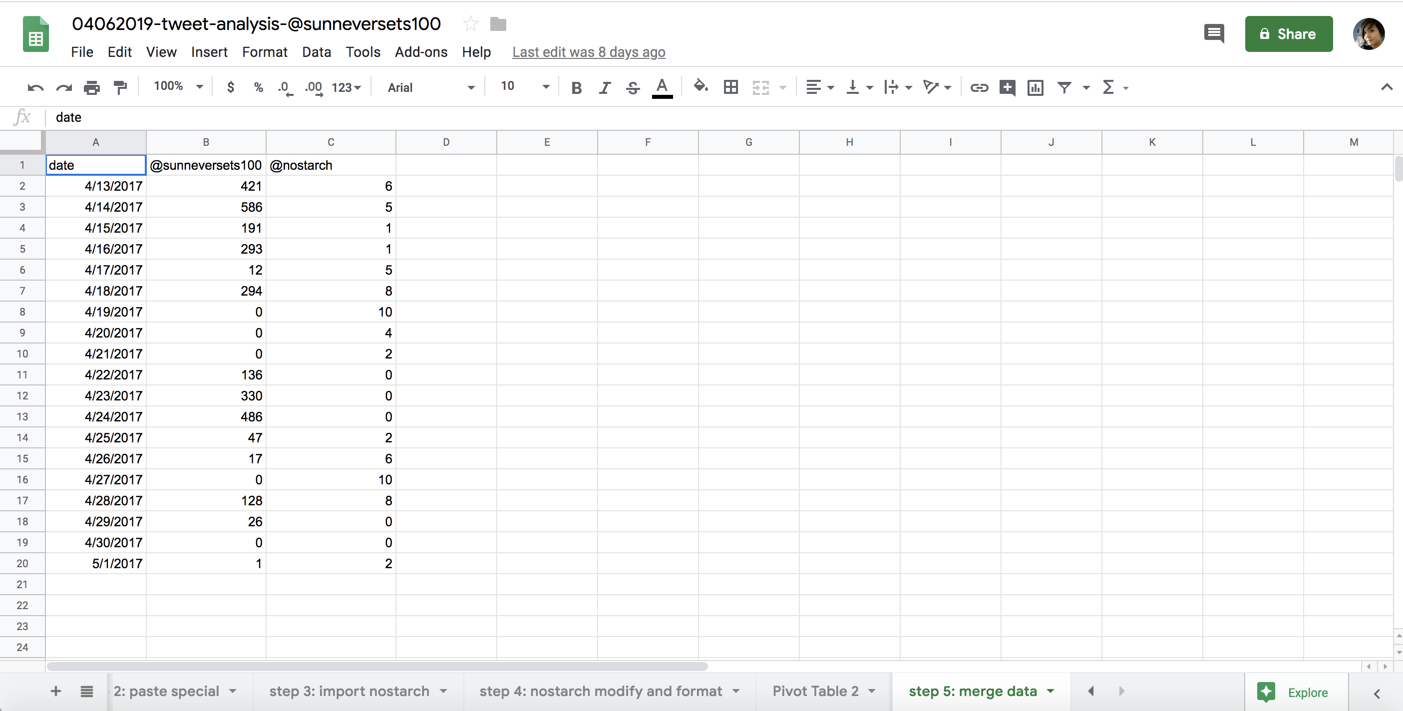
Figure 7-1: A spreadsheet comparing the tweet activity of a suspected bot account with an account controlled by a person
The spreadsheet clearly shows that @sunneversets100 tweets a lot more than the user chosen as a comparison. But it can be difficult to comprehend how numbers compare to one another just by reading about the findings in text or looking at the values in a spreadsheet. This is where data visualizations like charts can help.
Choosing a Chart
Charts and data-driven graphics can give us an instant understanding of a larger context. We can use shapes (for example, circles, rectangles, or lines) and colors to compare values, including how they change over time. These visualizations can help our audiences see patterns or key findings at a glance.
Before we can use them, though, we need to learn about the different types of charts. Some chart types are known mostly within the circles of statisticians or data crunchers, while others are more familiar to the general public. With that in mind, it’s important to recognize that any given chart may be very effective at conveying one type of data, but completely fail to convey another. For that reason, we need to consider what we want to show using the chart. As you learned earlier, data analysis is a bit like interviewing. Determining an answer for each question requires a slightly different set of tools, and asking questions of our data set can help us determine what kind of chart to use for finding answers.
Choosing the right chart can be tricky, but lucky for us, there are numerous guides that scholars and graphics editors have developed to help. One example is the one-page “Chart Suggestions—A Thought-Starter,” a flowchart of some of the most common types of data visualizations, shown in Figure 7-2.

Figure 7-2: A guide developed by Andrew Abela, © Andrew V. Abela, 2012. Abela, A. Advanced Presentation by Design.
Let’s break down the different chart types and how they are used. First, there are comparisons between different data sets. For instance, in our previous analysis we compared two data sets: one of a bot and one of a human.
One common comparison chart is a column chart like the one shown in Figure 7-3, which plots the merged pivot tables from Figure 7-1 (you’ll learn how to make these charts later in this chapter).
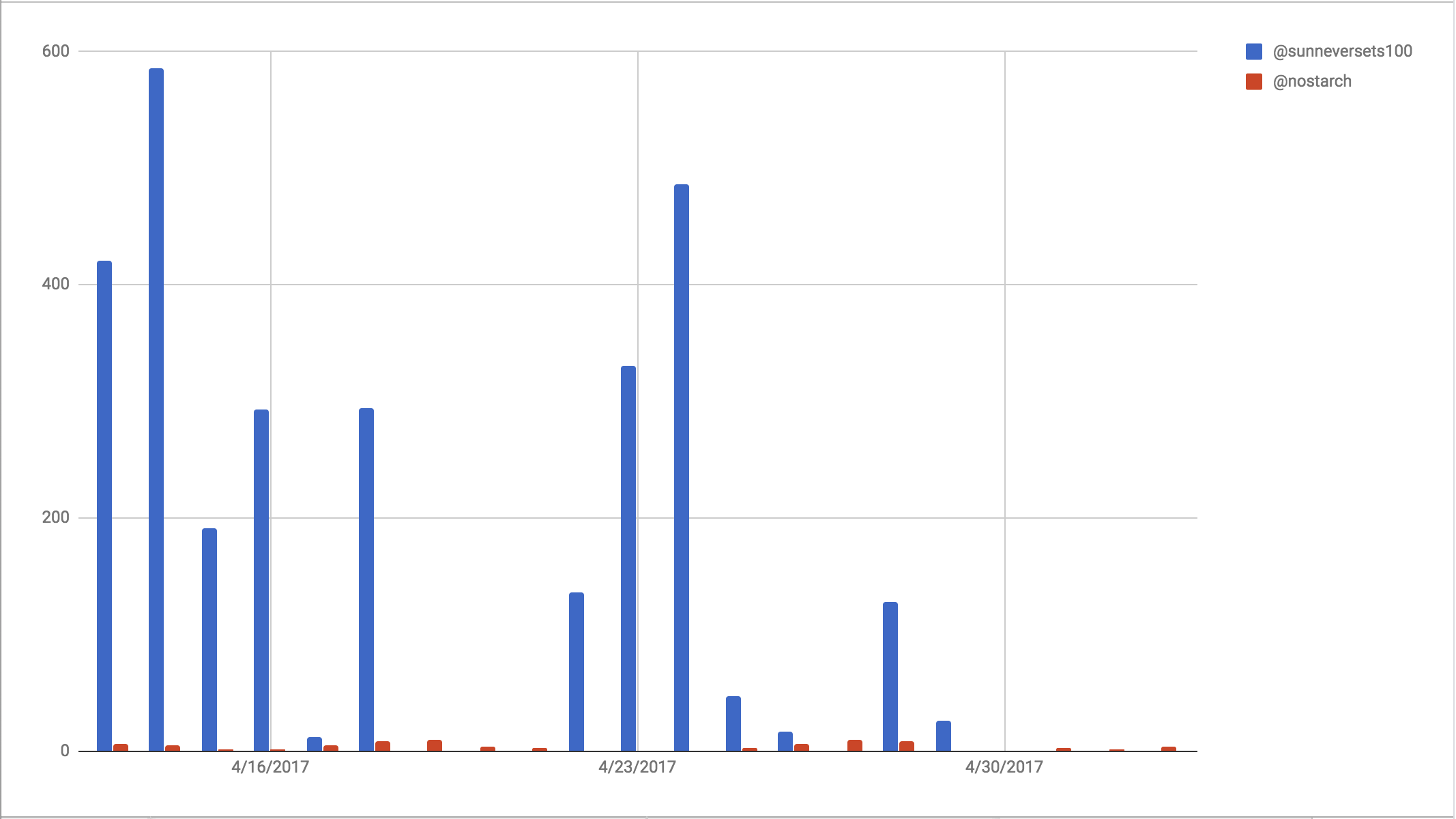
Figure 7-3: A column chart comparing the activities of a bot and a person
In addition to using charts to compare individual data points, you can use them to compare the distribution, or range of values, of a data set. Imagine dividing up your entire data set into buckets—for example, age brackets or grades (A to A–, B+ to B–, and so forth)—and then counting how many or what percentage of them occur in each bucket. That’s a basic way to understand distributions.
Returning to the @sunneversets100 data, for instance, we could look at the distribution of retweets that each tweet received. In the “raw data” spreadsheet pictured in Figure 6-3 on page 106, you’ll see that the retweet values range from 0 to 1–100, 101–200, 201–300, and so on.
Consulting the flow chart in Figure 7-2 for guidance again, we see that for data with a small distribution like ours, we should use a simple column graph like the one in Figure 7-4.
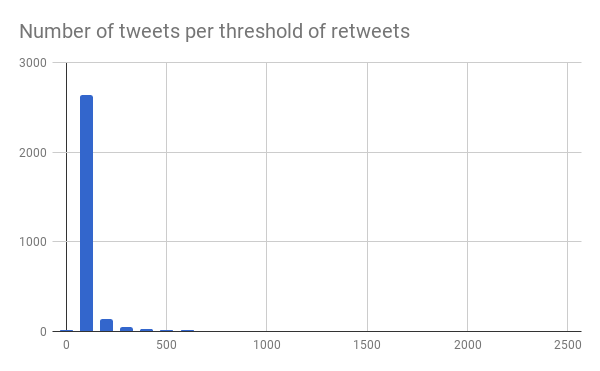
Figure 7-4: A chart showing the distribution of the number of tweets per threshold of retweets
We may also be interested in learning about the makeup of an entire data set, regardless of subdivisions like age brackets or retweet thresholds. In other words, we may just want to look at the composition of a data set, and we can use charts to understand how one part of a data set relates to the whole. In the example distribution chart in Figure 7-4, we see that the majority of tweets—more than 2,000—received between 1 and 100 retweets, which in this case shows us that the bots may have been somewhat effective in garnering engagement around tweets, but not remarkably so.
Bots are often used to amplify others’ messages, which means they don’t tweet as much original content. For that reason, it may be interesting to see what proportion of @sunneversets100’s tweets were retweets. The pie chart in Figure 7-5 shows us that 99.4 percent of @sunneversets100 were retweets.
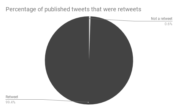
Figure 7-5: Pie charts and donut charts are great for showing proportions of categories within a whole.
Last but not least, you can use charts to show that data categories can have different relationships. For example, you can ask how one value relates to another and research whether the behavior of one value column causes the values of another to decrease or increase, or if the values of one column relate to how the values of another behave. Charts help us illustrate these relationships.
For instance, we might try to understand the relationship between the time of day when a tweet was sent and the number of retweets it received. In other words, are there times of the day when tweets performed particularly well in terms of retweet engagement? One good way to determine this is a scatterplot, where each data point is placed along an x-axis (the horizontal axis in a coordinate system) and a y-axis (the vertical axis).
Usually, researchers are interested in measuring how one dependent variable or data set that may change due to external factors, like the sale of umbrellas, is impacted by an independent variable or data set that cannot be controlled, like the occurrence of rain. In an experiment where researchers wanted to find out how much the occurrence of rain affects umbrella sales, we could use a scatterplot to see the relationship. The convention is to plot the independent variable along the x-axis and the dependent variable along the y-axis. In this case, we could ask ourselves this: Did the time of day affect how many retweets a tweet received? Figure 7-6 shows a chart that plots these variables along the x- and y-axes.
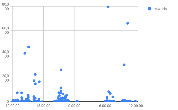
Figure 7-6: A scatterplot of all tweets that @sunneversets100 tweeted, plotted by the time of the tweet along the x-axis and by the number of retweets along the y-axis
Specifying a Time Period
One last aspect to keep in mind before making a chart is the time period that you want to use for your data set. The questions you ask of your data set will often require you to specify a particular point in time or a longer time frame. To plot this kind of chart, known as a time series, we’ll have to aggregate our data into small chunks of time, such as by the timestamps of tweets or an even less granular time unit like a month or year.
In the previous chapter, for instance, we used pivot tables to tally the daily tweets for @sunneversets100 and @nostarch, thus creating a time series for our charts. Then we merged the two data sets based on the time frame they had in common. This allowed us to compare them side by side.
Now that you’ve seen some ways to help you choose the right visualization for your data, let’s take a look at how to make a chart in Google Sheets.
Making a Chart
Whenever we set out to make a chart, we need to take several steps:
- Formulate a question.
- Do the data analysis that will help answer the question.
- Choose the best chart format and tool to help answer your question.
- Format and arrange the data in such a way that the selected charting tool understands it (in this case, that tool is Google Sheets)
- Insert or select the data and then use the tool to create a chart.
Luckily, Google Sheets, like Excel, offers a helpful suite of charting tools that allow you to add quick graphics directly in your spreadsheets. To keep this exercise simple, we’ll make a chart using our findings from the previous chapter. Let’s walk through the steps just laid out.
The central question we tried to answer with our analysis was how the behavior of a bot compares to the behavior of a human. The analysis we did to answer this question resulted in a time series of a little less than three weeks. That takes care of steps 1 and 2.
Next comes choosing the best chart format for the analysis. We’re trying to compare two data sets—the daily tweet activity of both a bot and a human—and we want to show this comparison over time. The flow chart from Figure 7-2 suggests using a column chart.
Now we format our data. As we discussed in the previous chapter, one central part of working with data—be it in Sheets or Python—is to clarify what kind of data each spreadsheet column contains. This will help our tools and programming languages interpret the data correctly.
In our column chart, we’ll plot time values along the x-axis and numeric values (tweets from each account per day) along the y-axis. Thus, we should make sure that Sheets receives values for dates in one column and values for numbers in two other columns (the two columns representing the daily tweeting activities for our bot and human accounts), as shown in Figure 7-7.

Figure 7-7: A spreadsheet containing all the values needed for a chart plotting activity over time
Using what we learned in Chapter 6, we select the data in the column containing our dates and then format it by selecting Format> Number> Date. Then we select the columns containing tallies for each account’s Twitter activity and format them as numbers by selecting Format> Number> Number.
For the next step, we need to select what kind of chart we want to use to plot our data. As before, make sure you select all the data you want to chart—in this case, the columns containing the formatted dates and Twitter activity levels—and then select Insert> Chart.
This should insert a chart directly into our spreadsheet, as shown in Figure 7-8, and simultaneously open a window called the Chart Editor.
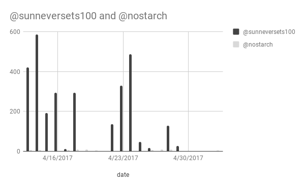
Figure 7-8: A chart showing roughly three weeks of Twitter activity for a bot and a human
The Chart Editor allows us to modify our chart and consists of two tabs: Data and Customize. From the Data tab, we can adjust or modify the content of our chart, like the range of cells we’ve selected to make the chart or which rows represent the chart headers. For this exercise, let’s start by selecting Column chart under the Chart type drop-down menu.
From the Chart Editor’s Customize tab, we can stylize our chart; for example, we can change the chart’s title, set the minimum or maximum values of the axes, or select a different font for the chart text. Let’s change the color that represents the bot data by selecting the menu item Series. This should expand a drop-down menu containing the two data series we plotted—the bot data and the human data. Each series is usually named after the column title. For this exercise, we could select @sunneversets100 and change the color of the columns using the color palette under the bucket icon.
Last but not least, we can move the chart onto its own sheet by clicking the three dots at the upper-right corner of the chart and selecting the Move to own sheet… option. This is helpful if there are nuances of your data set that are more visible on a larger screen.
While we can’t explore every type of chart offered by Sheets, the principles laid out in this chapter should help clarify what steps you need to take before diving into data visualizations. As always, it’s important to think about what you want to explore beforehand by asking questions about your data. If you follow the process set out in this chapter, you can more easily determine the right way to visualize your data for analysis.
Conditional Formatting
So far we’ve discussed how to format data as a chart so it’s easier for our audience to interpret. While many people encounter charts and graphics at school, at work, or in the media, few may be aware of the alternative tools for formatting data within a spreadsheet. These tools allow you to visually analyze your data without needing to go through the process of creating a chart.
One particularly helpful feature in Sheets is called conditional formatting, a tool that colors cells in a spreadsheet based on a condition. It’s a bit like being able to write if statements in your spreadsheet. For example, you could make a conditional format that says if the value in a cell meets a specific condition, then fill the cell with a specific color. You can picture conditional formatting as a robot going through your spreadsheet with a highlighter, changing the color of cells based on rules that you set.
Single-Color Formatting
To understand exactly how conditional formatting works, let’s apply it to our Twitter data set. Let’s say we want a quick way to tell whether a value is above our threshold for suspicious or highly suspicious tweeting activity. With conditional formatting, we can tell Sheets to use one color for any cell displaying a number equal or higher than 72 (and below 144) and another color for any cell displaying a number equal to or higher than 144.
In order to apply conditional formatting to our cells, first we need to select the cells to apply our rules to. Then we select Format> Conditional Formatting, which opens a window in Sheets called Conditional Format Rules. This is where we’ll specify the rules for our spreadsheet.
First let’s see how we can apply single-color formatting to our spreadsheet, which means applying one color to a group of cells based on a condition. We’ll start by coloring any cells that contain a number from 72 to 143 in yellow: these are days when the bot tweeted a suspicious amount of times. Select the Add another rule option in the window under the Single Color tab. Under Format cells if… select Is between. You should see two fields in which you can specify two values: a minimum and a maximum. To be colored yellow, a cell must contain a value within this range. For our Twitter example, enter 72 as the minimum and 143 as the maximum. Then, under Formatting style, select the color to highlight the cell. As mentioned, we’re using yellow to indicate that the tweet activity is suspicious.
To add another formatting rule, select Add another rule in the single color tab. As we did before, select Format cells if…, but this time select Is greater than or equal to for the condition and set the value to 144. Then, under Formatting style, choose a different color. In this case, I chose red.
Once you’ve set these two rules, your spreadsheet should color the cells that display values from 72 to 143 in yellow and values equal to or greater than 144 in red, as shown in Figure 7-9.
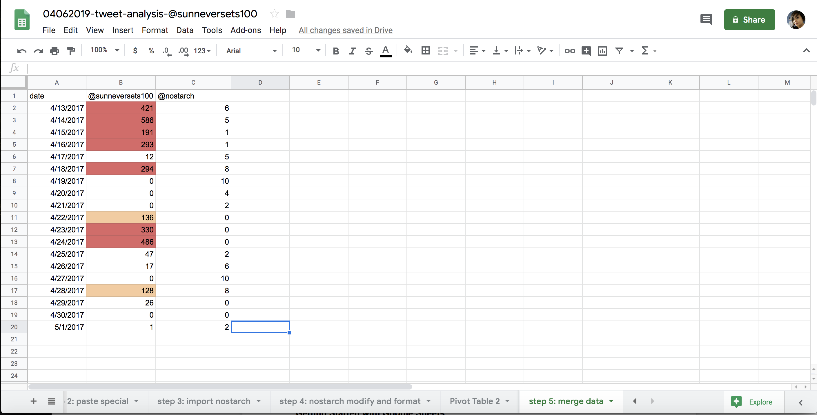
Figure 7-9: A spreadsheet that has been colored according to conditional formatting rules
Now you should be able to look at your spreadsheet and quickly detect suspicious behavior and highly suspicious behavior.
Not only can we use single-color formatting to set individual rules to color cells, but we can also format cells in a range of colors. We’ll look at that next.
Color Scale Formatting
Instead of using individual rules to format our spreadsheet, we can use a color scale. If we choose this option, Sheets will look at all the cells we selected, find the lowest and the highest value in the data set, and then shade each cell according to a color scale. The cells containing values closer to the lowest value will be shaded in the color to the left side of the color scale. The closer a value is to the higher end of our data set, the closer it will be to the color on the right side of the color scale. This is an alternative way to look at the distribution of a data set if you’re not ready to make a chart.
We open the menu for color scale formatting the same way we did for single-color formatting: highlight the data, select Format> Conditional Formatting, and then select the Color scale tab in the Conditional Format Rules window. Your spreadsheet should now look something like Figure 7-10.
While this kind of formatting is not as precise as single-color formatting, it’s an incredibly helpful tool for visualizing how the values of a data set compare to one another. Single-color formatting allows you to set specific thresholds. It’s a little bit like picking out values from a category and asking whether or not they fit a specific criterion. In the previous example, that meant we were looking for dates where the bot displayed suspicious behavior. Our question required a true or false answer: on any given day, did the bot tweet 144 or more times? In contrast, the color scale serves more of an exploratory purpose. We don’t quite know what our threshold is or how we want to qualify a value, but we want to understand the range and distribution of the values we have at hand.
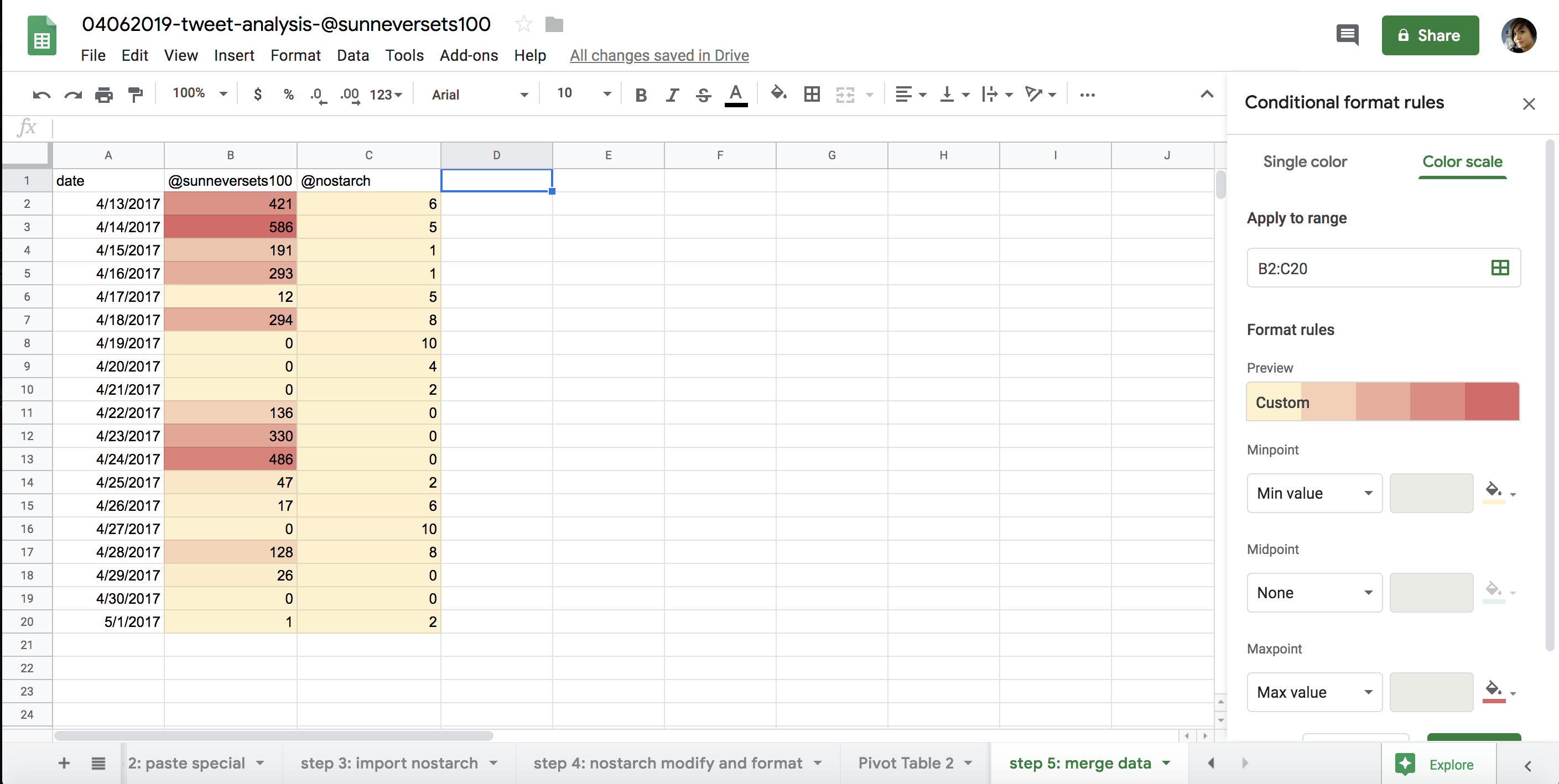
Figure 7-10: A spreadsheet formatted with a color scale
Summary
In this chapter, you learned about the different visual tools that Google Sheets offers. While we didn’t have space to look at how every chart type works or how to modify the data for each one, you should now have a general sense of how Sheets visualizations work.
The easy-to-navigate buttons and menus of Google Sheets are a good way to familiarize yourself with data analysis through visuals. You’ll find you can apply the same concepts you’ve learned from this chapter—casting the right data visualization for the right kind of analysis—when you start doing more code-driven analysis in the next chapters.